
National museums Scotland Website
During my time at City of Glasgow College, I had to do several graded unit website projects. I would say this was my personal favourite to both design and build. I was given a very vague brief to design a website for National Museums Scotland which could appeal to both children and adults. I loved having creative freedom for this design and being able to do whatever I wanted.
DISCLAIMER: This website is purely a mock-up for a college graded unit and is in no way associated with the National Museum of Scotland.

Plan for wesbite
I wanted to create an easy to navigate home screen for the website which would keep the attention of children while also being informative and attractive to adults. I included lots of images and bright colours to make the website look more attractive. I included a simple navigation bar along the top to allow the user to jump between pages easily.

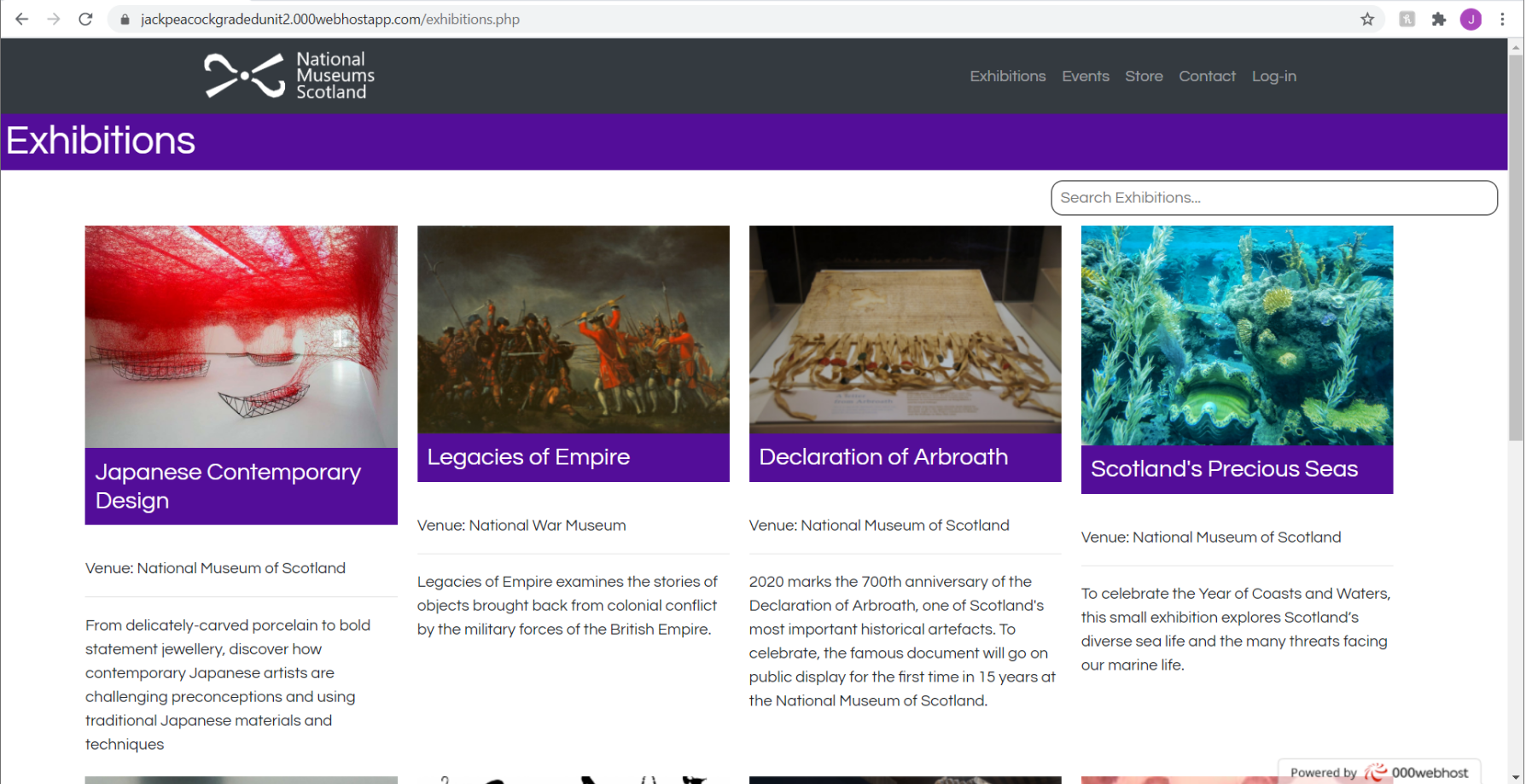


Design
Above is a showcase of the other pages located within the Museum website. I tried to maintain a simplistic design and kept a consistent header navigation menu to allow users to easily navigate the website and always have the option of returning to the home page by clicking the logo in the top left. All links to internal pages were clearly labelled in the header menu and were easy to read. The use of bright vibrant colour was used as a way to make the website more appealing to younger users and create a user friendly design. The colours remained consistent through the design so the user could associate a certain colour with a web page or section of the website e.g. Purple was used for the Exhibitions page but nowhere else. Any inputs from the user were made large and bold on the page for ease of use and all images were optimised for the web pages so they appear clear no matter what device the user is viewing it on. A desktop version and a mobile version was created for the assessment and all elements were rescaled and rearranged to best fit the device used.
Creation
All pages were designed using Adobe XD and went through multiple design and layout changes before I settled on the final design. The actual physical website was constructed using HTML5 and a variety of other languages including CSS, Javascript and external links to databases through Visual Studio Code. The website was never put onto a live server but onto a hosting server purely so that I would be able to present the website working in a real prototype test for my lecturers over a zoom call. The website had many functions to perform such as easy and consistent navigation (links clearly labelled and go to designated pages), user inputs for logging into the website and booking tickets for events and a list creation for the users shopping cart in the gift shop section.
Feedback
My Lecturers thoroughly enjoyed my presentation claiming it to be “professional and informative”. The feedback was mostly positive saying that the design suited the clients brief very well and the design was bold and innovative for both younger users and veteran internet users. The website worked as intended from a functionality view for the most part, there was some small issues with the account creation for the site simply due to time constraint I didn’t have the time to create and link an external database for storing user information. After the presentation was finished we had a short question and answer session about my personal thoughts on the design and functionality of the site and their feedback and marks on my work. Their feedback was overwhelmingly positive with only some short comings as mentioned previously.